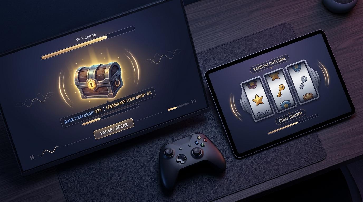
Reward loops are everywhere in interactive design. You clear a difficult encounter, hear a satisfying sound, see an item pop into your inventory and think, “One more go.” Or you tap a button, watch symbols settle into place, and wait for the result.
The mechanics can look similar at a glance, but it’s important not to flatten them into the same experience. A single-player RPG, a competitive action title and a reel-based game are built around different purposes, rules and expectations. Still, they often use related design tools: uncertainty, feedback, visible progress and carefully timed moments of anticipation.
For TwistedVoxel readers, that makes reward loops worth examining as a piece of design craft. Once you recognise the parts, you start noticing them everywhere, from a rare loot drop to a battle pass meter quietly filling in the corner of the screen.
Randomness gives every result a little tension
Random number generation, usually shortened to RNG, is a familiar part of gaming. You might defeat a boss several times for a particular weapon, hope for a critical hit during a difficult fight, or open a reward chest whose contents are selected from a table of possibilities.
That uncertainty changes how a result feels. If an item is guaranteed, it can still be useful, but it lacks the little question mark that comes with a random outcome. You know what is coming. RNG introduces a gap between action and answer.
Digital systems can use that gap in several ways:
- Loot drops can make repeated activities feel less predictable.
- Critical-hit systems add variation to combat calculations.
- Procedural rewards alter which gear, modifiers or materials appear.
- Rotating objectives give familiar gameplay a different shape from one session to the next.
- Reel outcomes present a result after symbols stop in sequence.
The meaningful difference is what the player can influence. In an action game, you may improve your positioning, timing, build choices or knowledge of an encounter. The random reward sits alongside skill, rather than replacing it. A rare drop may be uncertain, but beating the challenge often requires deliberate input.
Reel-based systems are chance-led by design. Pressing the button sets an outcome in motion, but it does not create a skill route to a different result. That distinction matters, particularly when an interface makes interaction feel hands-on. Selecting a stake, stopping to watch symbols land or choosing a visual theme can create a sense of participation, yet participation is not the same as control over probability.

Transparent systems help players make clearer judgements. In games, this might mean displaying drop rates, explaining how a pity timer works, or telling you exactly what a stat changes. In chance-based products, clear odds information and plain explanations are equally important. If people cannot tell what is random, what is fixed and what their choices actually affect, the design is doing too much of the thinking for them.
Sounds, flashes and timing do plenty of the work
A reward is rarely just a number on a screen. Designers give it texture.
Think of the tiny pause before a chest opens in an RPG, the rising tone as an experience bar approaches the next level, or the punchy sound that follows a successful parry in an action game. These signals tell your brain that something meaningful has happened, often before you’ve had time to read the details.
A well-built feedback loop usually combines several elements:
- Anticipation
- Confirmation
- Recognition
- Next-step prompting
Live-service games are especially fond of this rhythm. You finish a match, the screen tallies experience, medals appear one at a time, and a row of challenges updates. Even when the reward is modest, the presentation says, “That session counted.”
Reel interfaces use comparable audiovisual grammar. Symbols may slow as they approach their final position. A winning line is highlighted. A short musical sting separates ordinary outcomes from notable ones. Near-miss presentation, where symbols appear close to a winning arrangement, can feel particularly prominent because it creates a visual story of almost getting there.
That feeling is a design effect, not evidence that a later result is more likely. Random outcomes do not remember what came before. It’s a useful reminder for anyone interacting with chance-led systems: a dramatic display is still a display.
Haptics can make this stronger. A small controller vibration for a critical hit, or a mobile pulse when a meter completes, brings feedback into your hands. Used with restraint, it makes controls feel responsive. Used constantly, it can turn every tap into a demand for attention.
Good UI pacing gives you enough information to understand what happened. Less considerate pacing buries the important part beneath noise, flashes and rapid prompts.
When progress is real, and when it only looks like it
Progression is one of the most reliable ways to make an experience feel purposeful. Most of us enjoy seeing a character become stronger, a map fill out or a collection become more complete.
The complication is that not every progress cue represents meaningful progress.
An RPG level usually changes your available abilities, stats or access to new areas. That is tangible progression. A collection log can also be meaningful when it records discoveries and helps you plan what to do next.
Other systems create the appearance of forward movement without changing the underlying experience very much. Consider:
- a daily login calendar;
- a segmented meter that resets at regular intervals;
- a battle-pass-style track filled with small claims;
- a “nearly complete” collection with items chosen at random;
- a countdown that frames a routine task as urgent;
- repeated milestones with different colours but identical outcomes.
None of these are automatically bad. A daily reward can give a returning player a simple goal. A battle pass can provide structure across a season. The question is whether the mechanic respects your time and makes its purpose obvious.
Variable reinforcement is part of the picture too. Instead of rewarding every action in the same way, a system varies the timing, size or form of feedback. One match might provide a new cosmetic item, another a small currency amount, and another nothing beyond the standard result screen. The inconsistency can make each reveal feel more significant.
In game design, this can support variety. Yet it needs boundaries. When progress systems lean too heavily on uncertainty, timers and repeated prompts, players may spend more time monitoring rewards than enjoying the actual game.
A simple test helps: if all the meters, notifications and claim screens vanished, would the core activity still be satisfying? If the answer is yes, the reward loop is supporting the experience. If not, the loop may be carrying more weight than the activity itself.
Ethical UX means leaving room for a genuine choice
Player agency is not just about offering lots of buttons. It means giving people understandable choices, enough space to pause and controls that work when they need them.
That matters in games with optional purchases, recurring engagement systems and randomised rewards. It matters even more in chance-based products, where outcomes are governed by probability rather than player skill.
Thoughtful UX can include:
- Clear probability information, written in plain language rather than hidden behind menus.
- Spend friction, such as confirmation steps and visible totals, so decisions are not made in a blur of taps.
- Cooldowns and breaks, which interrupt endless repetition and create a natural moment to reassess.
- Session reminders, showing how long someone has been active.
- Accessible design, including readable text, reduced-motion settings, colour-safe indicators and audio controls.
- Parental controls and account safeguards, helping account holders set boundaries where appropriate.
- Notification restraint, so a game does not turn every absence into a stream of pressure.
There is a fine line here. Friction is often treated as a dirty word in product design, but not all friction is a flaw. A confirmation before an irreversible action can be protective. A reminder that a session has gone on for a while can be useful. A clearly labelled odds screen gives a person information they might otherwise miss.
For gambling products, responsible-play features should be easy to find and simple to use, not tucked away after several screens. Age restrictions should also be unambiguous. Gambling is for adults aged 18 and over, and it should be approached as paid entertainment with uncertain outcomes, never as a source of income or a solution to money concerns.
Games can learn from that clarity. If a system contains randomness, paid items or repeated prompts, players deserve to know what is happening and what choices remain in their hands.
Contextual resource
18+ UK readers looking at reel-game interface examples can consult Rainbow Riches Casino’s slot machine games catalogue.
Look past the sparkle and read the loop
Reward loops are compelling because they combine uncertainty, feedback and a sense of movement. A rare item dropping after a hard encounter, a progress bar completing with a satisfying sound, or a set of symbols stopping one by one all use timing to make a result feel important.
But the context changes everything. Skill-based games, randomised game systems and chance-led reel products should not be treated as interchangeable. Ask what you can genuinely influence, whether probabilities are clear, what the interface is encouraging you to do next, and whether there is an easy way to stop.
That little framework won’t make reward loops disappear. It does make them easier to see for what they are: designed sequences of prompts, outcomes and feedback. And once you can spot the design, you’re in a better position to decide how you want to engage with it.